Filegazer, The StartMenu for OS X
One of the things that bugs me with OS X, and something that Apple themselves have addressed, is Finder. Mac fan or not, you have to admit that trying to access programs isn’t as simple as some other operating systems (XP for example). With Finder, you have to open it up, click on Applications, scroll through, find your application and double click. Now compare that to Windows XP which is a case of clicking on Start, moving your cursor to Program Files and then to the program you want and you see my first point. Okay, so I’m being picky, but Finder really isn’t the most fun I’ve had in a day.
So what do you do if you’re as niggly as me? And what do you do if you’ve just switched from Windows XP to OS X and are happy with XP’s Start Menu? Well, you could download Quicksilver, the excellent little application that asks you to simply type in the first few letters of a program to open it, but then this can sometimes backfire if you’ve entered one letter too many. Anyone tried opening Yahoo Messenger to accidentally open up a Yahoo RSS feed?
The other alternative would be to put a shortcut to your Applications folder in the dock but it doesn’t quite have the same appeal, especially with the likes of Filegazer. Oh yes, I finally got to my second point.
Filegazer is the Start Menu for OS X.
It provides a fast and effective way of navigating through your system with as few clicks as possible and highly customizable too.
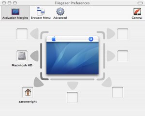
You have the option, within the preferences pane, to select up to 8 ‘hot spots’ on the screen which the screenshot below will be able to explain better than I can. You can ask the hot spots to jump anywhere on your computer. So if you fancy dragging your cursor to the top right hand corner of the screen in order to open up, say, your ‘Movies’ folder, then you can do so. If you’re curious as to whether this interferes with Exposé, then I can confirm it doesn’t. Exposé requires you to touch deep into the corners of the screen in order to activate it, whereas Filegazer sits close to, but above the corners. If this does still bother you, it’s possible to select an Activation Key (such as Command, Option etc) which you must hold onto whilst dragging your cursor to the edge in order to activate the Filegazer menu.

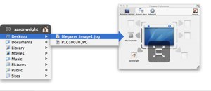
When you activate the Filegazer menu system, you see something rather similar to Windows XP start menu, albeit a lot faster. You can guide your way through the whole system, previewing almost all the major format types, including .jpgs (see above), .mov, .pdf, .rtf etc. I was particularly impressed to see the previewing of movies and music without actually clicking (I was highlighting) anything. It’s possible, and simple, to adjust image sizes in the preview, view whole Word documents, HTML pages and all within a matter of seconds. I realize Finder allows you to do this as well, but not this efficiently.

However, Filegazer doesn’t allow you to do anything other than preview and open files and folders. It’s not possible to see more information (’Get Info”) of files, you cannot copy and paste, rename, delete or move any files at all. This application is simply a means of accessing info quickly and not a lot else.
It is possible to adjust the speed in which the menu operates through the preferences pane, although when I tried this I didn’t see much of a difference in loading times. I guess only Superman would be able to notice the difference between 0.4 and 0.5 seconds. They could have added a bit more variation in that respect.
I do give a thumbs up for the customization theme options involved. Please don’t get too excited though as I think this applies to paying customers only. I noticed on the website that it was possible to ‘skin’ the application to fit the look and feel of your operating system, whether you’d like it to look like Aqua or another theme you have implemented, it’s apparently possible. I’ve not come across this feature at all during the Shareware version, so I can only assume it’s for those whom pay.
One thing I’m a little fussy about though is the closing of the Filegazer menu (not the actual application). If you’ve ever used Windows, you’ll know that when you click on the desktop it removes the Start Menu from view. I wish this was something the creators, Donelleschi, had thought of. The only way to remove the Filegazer menu from view is by clicking on the ‘X’ to close it. Although I understand that it would get annoying for people who wanted to adjust the size of a previewed image only to find that the menu closes, but surely they could have implemented a system so that the menu disappears from view when clicking elsewhere on the screen except if there’s an image (or any other file type) being previewed. That’s probably something that just bugs me though and shouldn’t put anyone off from giving it a try.
Pros
Fast
Skinnable
Customizable (plenty of options)
Shows previews of all major files types
Clever options to stop with the interfering of Exposé
Cons
Annoying that it doesn’t close automatically when cursor is clicked elsewhere on the screen
Shareware - A regular window will appear asking to purchase the product.
All in all, a good fast and almost free alternative to Finder, Quicksilver and some home-made remedies of accessing files and folders on your system. It’s good, but with the likes of Quicksilver about, I’m going to say it’s probably not worth, in my opinion, buying—however, others may disagree.
Available from Donelleschi Software’s website on Shareware. You’ll notice it says it’s usable without any feature blocked. If anyone downloads and can find how to add themes to this, please let me know or leave a comment below.


Comments
The previews are the part of the application that really stand out for me. They are quick and useful and it doesn’t actually require you to open the document to do so. Have you tried increasing and decreasing the size of images as well in a preview?
Also, anyone that has tried this product, does the fact that it doesn’t disappear automatically when the cursor is removed from it annoy anyone?
Aaron - YES! I totally agree with you on that point. Tis most annoying having to close it after each use.
Anyone know what that turd-like or phallic looking Filegazer icon is? A couple months ago someone on VT asked if it was a horse or a sock puppet and I replied that it kinda looks like a sock puppet horse.
Seems too often some Mac users use the “Just because” argument. “Just because Apple does it this way, that’s the right, best and only way.”
There’s literally a tear in my eye right now. You really get it.
As for Filegazer, I’m always hesitant about these user-interface “add ons” because…well…they add on. It’s not that I don’t think the Start menu is better, it’s a question of whether or not I’m willing to sacrifice resources when I can live with OS X’s paradigm.
Can anyone say what kind of resources this thing uses?