The New Apple Keyboard
When Apple announced the updated iMac a couple of weeks ago, they introduced something that appealed more to me than the overall aesthetic change of the iMac; and let’s be honest, that was the only real difference from its predecessor. That change was, of course, the keyboard, with its slick design, flattened keys, and overall impressive looks.
The Feel
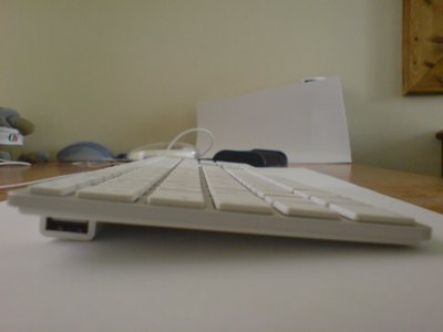
However, the real achievement lies in the ergonomics. With an overall height of around 20mm it feels as though the board is literally working its way out of your desk surface, at times almost allowing you to completely forget you have a keyboard at your fingertips.

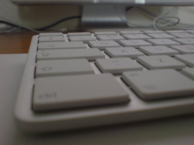
For anyone used to using his or her keyboard more than the average user (hello AM writers), you’ll be pleased to know how comfortable and fast it is to type, and no, there are no frustratingly loud “tap tap” noises when bashing the keys—it all seems so fluid. With the keys so flat, comparable to the MacBook’s keys I might add, typing errors seem to be squashed to a minimum.
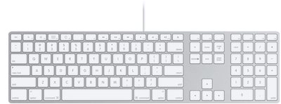
One slight annoyance, which will obviously disappear over the course of the “learning period” of the device, is that the Exposé keys and volume/brightness controls have been moved to the other side of the keyboard. As many know, the old Pro keyboard had its volume controls on the right hand side of the keyboard, just above the number pad. Well, the new keys now take home at F10 through to F12. You will of course now be wondering where the Exposé keys sit, and that’s at position F3 and F4 on the keyboard, with the “fn” key allowing more Exposé options if you wish.
One last important bit to note is the inclusion of media controls, which is something I found seriously lacking on the old Pro keyboard. F7 to F9 allow you to flick between previous and next songs on your iTunes playlist, as well as pausing and playing at your peril. All very fancy.
The Bluetooth or Wired Versions?
There are a couple of differences between the two versions of the new keyboard, apart from the price of course. The Bluetooth version does away with the number pad, presumably to give it a more compact feel given that Steve Jobs envisaged users using the Bluetooth version on their laps as opposed to their desks. Unfortunately, I’m not completely convinced by the Bluetooth version as it also seems to be lacking a couple of important USB 2.0 ports, something the Wired version does have over its counterpart. If you can do without this though, perhaps the smaller Bluetooth keyboard will suit you more.
The Look

I have to admit I wasn’t attracted to the keyboard right away; the thought of using a flat keyboard comparable to my old Logitech DiNovo set was much more appealing, but the aluminum design with sleek white keys that still match the older white iMac really does grow on you after a while.

Fortunately the iMac has an aluminum base so the two devices do go well together, but not quite a match made in heaven. I’d have much preferred a totally white keyboard, perhaps with aluminum keys instead. I’m still shocked at how flat the keys really are!
Summary
Apple doesn’t include a software update CD with the keyboard, so using it right away with its new keys isn’t going to happen unless you download the update from http://www.apple.com/support/downloads—yours truly had an internet problem the day the keyboard arrived so I couldn’t even take full advantage of it for a couple of days.
I’m incredibly impressed by how easy it is to type with the keyboard and I no longer get tired wrists after writing in-depth articles for Apple Matters, which is always a plus.
Upon first looking at the keyboard, it is understandable to think it could snap in two with the slightest knock; not to say it looks cheap, but simply because of the thickness (or thinness, shall I say?) of the keyboard. But the keyboard just reeks of quality, especially when you pick it up and feel how heavy it actually is, given its size.
And for those of you out there who get off on Apple product boxes, yes, it is pretty sexy!
Overall I’d say it was worth the money. There are other alternatives out there at half the price but, having used these in the past, I can honestly say the new Apple keyboard slaps them in the face. If you’re undecided on the Bluetooth or Wired versions, ask yourself how many USB ports you require, because the wired version comes with USB 2.0 now, as opposed to the older USB 1.1 found on the Pro keyboards.
Has Apple done it again? I can happily say, I think so.
Overall rating: 8/10—missing some extra “hot-keys,” but these aren’t a necessity
Cost: $49/£30 (Wired) $79/£49 (Bluetooth)
Requirements: OS X 10.4.10 or later, available USB 1.1 or 2.0 ports
Website: http://www.apple.com/keyboard/
Software Update: http://www.apple.com/support/downloads


Comments
I dare to disagree. Like all input devices, keyboards are a matter of taste. So you may well like this latest iteration of Apple’s peripheral incompetence. In my book, it is totally inadequate. The keys are widely set apart, and for a reason. Bare of any tactile guidance by cap-shape, this is the only chance of not constantly missing or double pressing. The tactile feedback is shameful. It basically consist of a sting of pain each and every time you reach the end of the - short - key-travel. You might as well get a laser-projected keyboard and hack away straight on your desk, which would pretty much feel the same way. Audible feedback is low, which might be nice in certain environments, but it is just that, low feedback. Also, Apple’s cynical “we know better than you” attitude reaches a new high with the re-mapped keys along with the - in some circles - furiously debated loss of the “Apple-key” (think about it what you want). Ever since the original iMac, Apple has been feeding us shoddy keyboards, and this one is no exception. You may like it if all you know is notebooks or the Apple “king of wobble” desktop terrors of late. It sure was not hard to come up with something better than the last one. At some points the only way is up. So the new keyboard is “up”. But not much. The looks are superbly clean, and the wireless version might be quite nice on the couch. Anyone truly concerned about their typing experience will happily stay with their Apple Extended II though. Residents of QWERTY-land have the added luxury of the Matias Tactile Pro at their disposal. It would be nice if Matias would finally commit to international customers too.
“and no, there are no frustratingly loud “tap tap” noises when bashing the keys—it all seems so fluid.”
Personally, I would have written it’s “frustratingly quiet with no response when bashing the keys—it all seems like mush.”
*Gasp* Apple is killing all forms of feedback from an input device, first it was the iPhone, now the keyboard! Who knows maybe the integrated iSight will take pictures before you know.
Unfortunately Aaron while you tempt us AM writers with a new Apple keyboard I am perfectly fine with my stone tablet and chisel, shipping via Snail Mail is a hassle however.
Aaron, the question of most interest to me is ergonomics of the health kind. How does it stack up after prolonged use? I use an ugly black MS Natural keyboard, which has eliminated RSI type pains and strains.
Looking at the new Apple keyboard, I fear I’d be back to square one, with sore arms, shoulders and head.
Have you noticed any improvements in this regard?
The biggest drawback to me is that I can see no way to adapt this keyboard to any kind of professional Final Cut Studio labels or keys. On my existing pro keyboard, I could replace the keys with color-coded app-specific FCP keys. On some keyboards, you can get overlays that accomplish the same thing. But there’s not really any way to do this here (maybe stickers, but those are crap), so even if I got a new iMac, I’d have to chuck this one and stick with my existing FCP keyboard.
Won’t an overlay come out soon?
Looks great. Koszalin info